

BI’s Best Friend: ML
Analytics is an ensemble game

BI might sound old school, but it’s still how real decisions get made.
Investigating a problem? You make charts. You look for patterns. Maybe distance goes up, and late deliveries go up too. That’s correlation, not causation of course, but it still points you toward the problem.
To find patterns, you can build 100 charts. Classic BI.
Or, let machine learning find the patterns for you.
It’s like BI with a telescope.
You’ve seen this dataset a hundred times: delivery performance.

You can slice it every which way:
Late rate by carrier.
Distance by carrier.
Distance by DC.
Late rate by weather_evt and carrier
Go ahead, plot ‘til the cows come home.
Or… take a sharper approach.
So you build a ML model; predict late deliveries.
The feature importance chart?

When I share these charts, everyone asks the same thing:
Is carrier = Budget17 good or bad?
Does longer distance insinuate better on-time delivery?
Does late delivery get more likely or less?
What’s the direction of the relationship?
That’s where BI steps back in.
You color code. You focus.
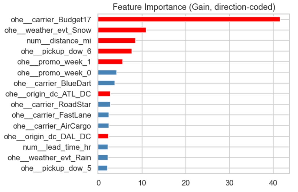
The “top” features appear to correlate to degraded performance. That’s good BI.
Still not actionable.
Just 4 features explain 80% of the model; carrier = Budget17, weather = snow, distance, and pickup day-of-week = Sunday.
Now, we don’t need to plot 100 charts. Just a few will suffice. Plot interactions.
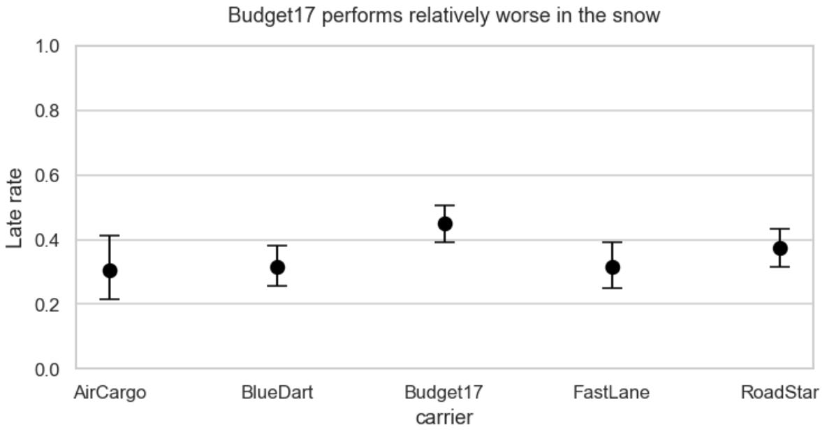
Snow vs. carrier =>
Distance vs. carrier =>
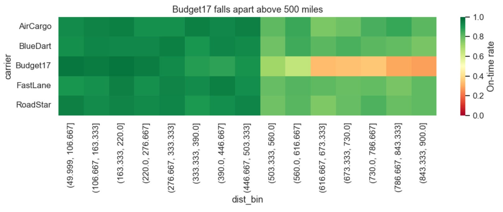
Is it snow or distance that trips up Budget17? If you control for distance, and re-plot snow vs. carrier, the answer is clearer… it’s distance.

That’s your lead.
The longer distance deliveries kills Budget17.
Should you fire that carrier? Remove them from longer lanes?
It might not be as clear of an answer as the heat-map makes it look. Maybe they are just getting bad loads…
Two possible reasons:
Structural – Their network is built for short hops. Long hauls need messy relays.
Selection – They get the last‑minute, high‑risk leftovers.
If it’s structural, you’ll want to replace the carrier or change the SLA. If it’s selection bias, even a different carrier might perform equally as poorly on these deliveries.
Which is it?
Time for another model. We want to know if Budget17 is just getting a relatively bad load mix.
Build a propensity model to predict the odds a load will go to Budget17 before it gets tendered.
Use just: distance, lead time, promos, pickup dow.1
Bucket the loads into deciles of predicted probability (that the load goes to Budget17).
Now compare late rates inside each bucket.
What you find: Budget17 performs 2–3× worse across the board.
That screams structure, not selection.

✅ Action playbook:
Get additional insight from operations.
Collect more data (freight class, temperature control, customer type).
Consider capping Budget17 at 500 miles or renegotiate their SLA.
Monitor every week.
Bigger point:
ML finds the pattern.
BI makes it actionable.
ML is your metal detector.
BI is your shovel.
Let ML beep where to dig.
Use BI to pull out the gold and hand it to someone who can do something with it.
Don’t be fooled. Selection bias also applies to the data that we have. There could be other features like freight class, temperature control, and customer type that could change the results of this analysis.